



Introduction
Have you ever wondered how schools analyze the performance of an entire class?
In this project, we will use a Python Notebook in PictoBlox to organize and analyze student marks. The marks of different students will be stored in a structured table, and Python will help us calculate useful information such as total marks, average marks, subject-wise statistics, and overall performance trends.
This project uses Pandas to manage data in tabular format and Matplotlib to create charts. Students will learn how to use Python to understand real-world data in a simple and meaningful way.
By completing this project, learners will understand how data analysis helps in comparing marks, finding patterns, identifying top performance, and visualizing results clearly.
Prerequisites
Before starting the activity, make sure you have:
- PictoBlox installed on your device
- PictoBlox version 9.1.0 or later
- Basic knowledge of Python variables and lists
- Understanding of the print() function
- Familiarity with running cells in Python Notebook
Setting Up the PictoBlox Notebook
Before writing the program, set up the Python Notebook environment in PictoBlox.
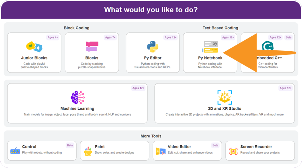
Step 1: Open PictoBlox
Open PictoBlox on your computer and select Python Notebook mode from the available programming modes.
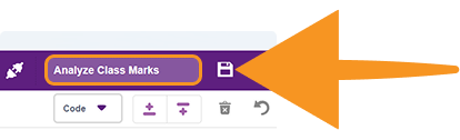
Step 2: Create a New Notebook
Create a new notebook and save it with the name: Analyze Class Marks
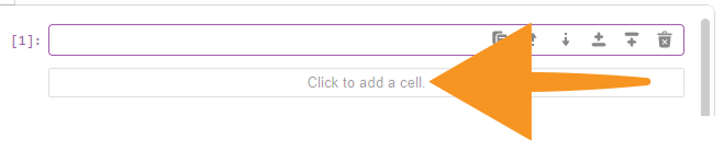
Step 3: Add a Code Cell
- Add a new code cell to begin writing the program.
- You will write and run the code step by step in separate notebook cells.
Python Coding Guide
Follow the steps below in the PictoBlox Notebook to analyze class marks. Run each cell one by one and observe the output at every stage.
Step 1: Import the Required Libraries
This step imports the libraries required for data analysis, visualization, and statistical calculations.
import pandas as pd
import matplotlib.pyplot as plt
from statistics import mode
This code prepares the Python environment for:
- Data analysis using Pandas
- Data visualization using Matplotlib
- Statistical calculations using mode()
Step 2: Create the Student Marks Dataset
Create a dictionary named data to store student names and their marks in different subjects.
data = {
    'Name': ['Alice', 'Bob', 'Charlie', 'David', 'Eva', 'Frank', 'Grace', 'Helen', 'Ian', 'Julia'],
    'Math': [85, 90, 78, 92, 88, 95, 70, 85, 79, 83],
    'Science': [80, 85, 89, 90, 87, 78, 88, 92, 79, 85],
    'English': [88, 79, 85, 91, 84, 77, 86, 90, 88, 82]
}
This dataset contains marks of 10 students in three subjects: Math, Science, and English.
Step 3: Create the DataFrame
Convert the dictionary into a Pandas DataFrame.
df = pd.DataFrame(data) A DataFrame is a table with rows and columns, similar to a spreadsheet or Excel sheet. It makes the data easier to view, manage, and analyze.Step 4: Display the DataFrame
Display the class marks data.
print("Class Marks Data:")
print(df)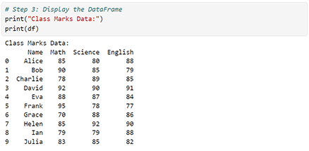
This step helps us check whether the data has been stored correctly before performing calculations.
Step 5: Calculate Total Marks for Each Student
Add the marks of Math, Science, and English for each student.
df['Total'] = df['Math'] + df['Science'] + df['English']This code creates a new column named Total, which stores the total marks of each student.
Step 6: Calculate Average Marks for Each Student
Calculate the average marks of each student.
df['Average'] = df['Total'] / 3This code creates a new column named Average.
For example, if a student scores:
Math = 90
Science = 80
English = 85
Then:
Total = 90 + 80 + 85 = 255
Average = 255 / 3 = 85
Step 7: Display the Updated DataFrame
Display the DataFrame after adding the Total and Average columns.
print("\nData with Total and Average Marks:")
print(df)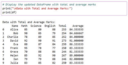
The output will show each student’s subject-wise marks, total marks, and average marks in a clear tabular format.
Step 8: Calculate Mean, Median, and Mode
Now, calculate important statistical values for each subject.
mean_math = df['Math'].mean()
median_math = df['Math'].median()
mode_math = mode(df['Math'])

mean_science = df['Science'].mean()
median_science = df['Science'].median()
mode_science = mode(df['Science'])

mean_english = df['English'].mean()
median_english = df['English'].median()
mode_english = mode(df['English'])
These values help us understand the subject-wise performance of the class.
- Mean: Average marks of all students
- Median: Middle value when marks are arranged in order
- Mode: Most frequently occurring mark
Step 9: Display the Statistics
Display the mean, median, and mode values for each subject.
print(f"\nMath - Mean: {mean_math}, Median: {median_math}, Mode: {mode_math}")
print(f"Science - Mean: {mean_science}, Median: {median_science}, Mode: {mode_science}")
print(f"English - Mean: {mean_english}, Median: {median_english}, Mode: {mode_english}")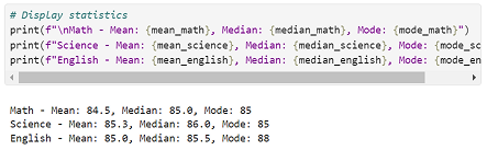
This output helps compare the overall class performance in Math, Science, and English.
Step 10: Create a Stacked Bar Chart
Create a stacked bar chart to visualize marks obtained by each student in different subjects.
plt.figure(figsize=(10, 5))
plt.bar(df['Name'], df['Math'], color='blue', label='Math')
plt.bar(df['Name'], df['Science'], bottom=df['Math'], color='green', label='Science')
plt.bar(df['Name'], df['English'], bottom=df['Math'] + df['Science'], color='red', label='English')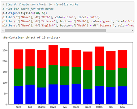
A stacked bar chart helps compare:
- Subject-wise marks of each student
- Total performance of each student
Step 11: Plot Total Marks
Create a line graph to visualize the total marks of each student.
plt.plot(df['Name'], df['Total'], marker='s', color='blue', label='Total Marks')

plt.xlabel('Students')
plt.ylabel('Marks')
plt.title('Marks Distribution by Subject')
plt.legend()

plt.show()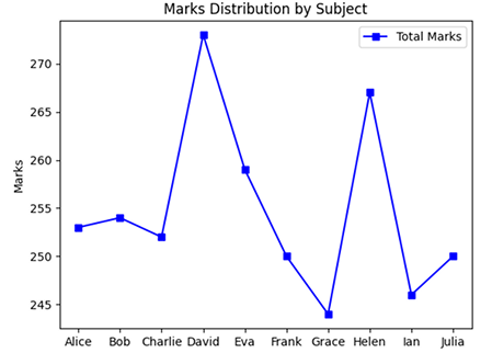
This graph makes it easy to compare the total marks of all students and identify high-performing students.
Step 12: Plot Average Marks
Create a line graph to show the average marks of each student.
plt.figure(figsize=(8, 4))
plt.plot(df['Name'], df['Average'], marker='o', color='purple')

plt.xlabel('Students')
plt.ylabel('Average Marks')
plt.title('Average Marks of Each Student')

plt.show()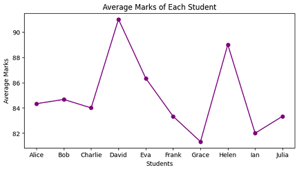
This graph gives a clear view of overall academic performance based on average marks.
Step 13: Create a Boxplot for Subject-Wise Marks
Create a boxplot to visualize the distribution of marks in each subject.
plt.figure(figsize=(10, 5))
plt.boxplot([df['Math'], df['Science'], df['English']], labels=['Math', 'Science', 'English'])

plt.xlabel('Subjects')
plt.ylabel('Marks')
plt.title('Marks Distribution for Each Subject')

plt.show()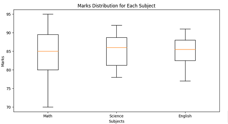
A boxplot helps us understand:
- Spread of marks
- Median marks
- Highest and lowest marks
- Possible unusual values or outliers
Step 14: Display Summary Statistics
Generate summary statistics for all subjects.
print("\nSummary statistics for all subjects:")
print(df[['Math', 'Science', 'English']].describe())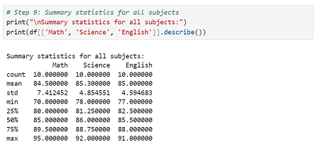
The describe() function displays important statistical information such as:
- Count
- Mean
- Standard deviation
- Minimum value
- 25% quartile
- 50% quartile
- 75% quartile
- Maximum value
Output
After running the program, you should observe the following:
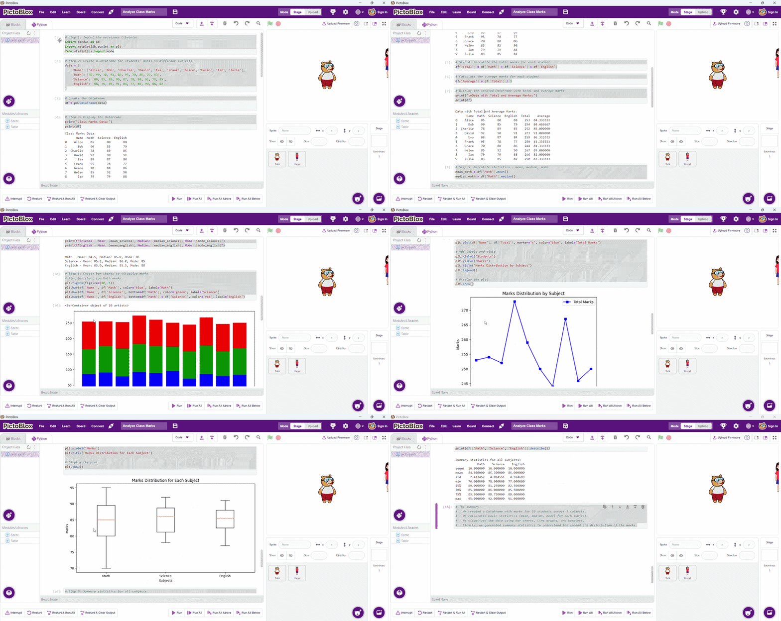
- A table showing class marks data
- A table showing total and average marks
- Mean, median, and mode values for each subject
- A stacked bar chart showing subject-wise marks
- A line graph showing total marks
- A line graph showing average marks
- A boxplot showing mark distribution
- Summary statistics for Math, Science, and English
Conclusion
In this project, we analyzed the marks of 10 students across three subjects: Math, Science, and English using a Python Notebook in PictoBlox.
We first organized the data into a Pandas DataFrame, making it easy to store and analyze student records. Then, we calculated total and average marks to evaluate each student’s overall performance. We also calculated statistical values such as mean, median, and mode to understand subject-wise performance trends. To make the data easier to interpret, we created different visualizations, including a stacked bar chart, line graphs, and a boxplot.
This project shows how Python can be used for real-world data analysis and helps students build a strong foundation in data handling, statistics, and visualization.