


Introduction
Have you ever wondered how data scientists make sense of large amounts of information at a glance? In this project, we are going to build an AI-powered data visualisation tool using PictoBlox — a Scratch-based graphical programming software designed for young learners. We will create a dynamic bar graph that automatically generates and displays the number of students in each class, all using the power of block coding and PictoBlox’s built-in Data Science extension.
By the end of this STEM project, you will understand how to use tables, variables, loops, and graph-plotting blocks to build real-world data visualisations — an essential skill in today’s data-driven, AI-powered world.
Setting Up Your PictoBlox Voice AI Project
Step 1: Add the Required AI Extensions
- Open PictoBlox
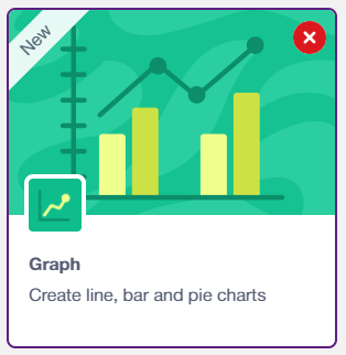
- Click the Add Extension button (the purple icon at the bottom left). Add Graph extension — creating dynamic graphs that update as values change.
Step 2: Select Your Sprite
You can use any sprite for this project—Tobi is a great choice, as it provides a friendly visual face for your AI assistant. Click on your chosen sprite before adding the blocks below.
Step-by-Step Guide
- Open PictoBlox and create a new Block Coding project.
- Choose your sprite — we used the default sprite for this project. Make sure you are logged in to your PictoBlox account before proceeding.
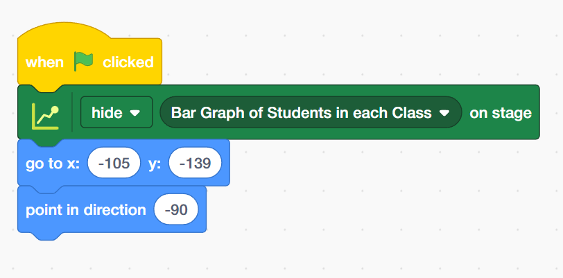
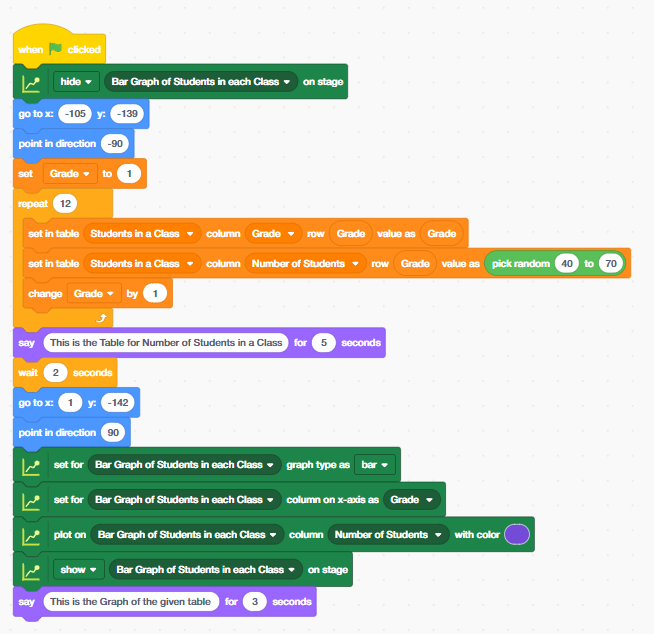
- ‘When the green flag’ is clicked, the script begins by:
-
- Add the ‘go to x: [-105] y: [-139]’ block from the motion palette. Moving the sprite to coordinates X: –105, Y: –139 (bottom-left area of the stage)
- Place ‘point in direction’ block, pointing the sprite in direction –90 (facing left)
- Hiding the Bar Graph sprite on the stage (we will reveal it later once data is ready)
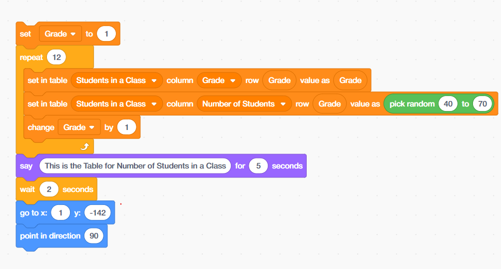
- Use the ‘Set [Grade] to [1]’ block from the Variables palette to initialise the Grade counter at 1. This variable will track which grade (class) row we are currently filling in the table.
- Place a Repeat (12) block — this loop runs 12 times, once for each grade from 1 to 12. Inside the loop, add the following two blocks from the Data Science palette:
- Add the ‘Set the table [Students in a Class] column [Grade] row [Grade] value as [Grade]’ block from the Variable palette — this fills the Grade column with the current grade number.
- Place the ‘Set in table [Students in a Class] column [Number of Students] row [Grade] value as [pick random 40 to 70]’ block — this simulates real classroom data by randomly assigning between 40 and 70 students per grade.
- Then add a ‘Change [Grade] by 1’ block to increment the grade counter after each loop iteration.
- After the loop completes, use a ‘Say [ ] for [ ] seconds’ block to display: “This is the Table for Number of Students in a Class” for 5 seconds. Follow this with a ‘Wait 2 seconds’ block to give the viewer time to read the message.
- Add ‘go to x:[1] y: [-142]’ and ‘point in direction[]’ block from looks palett. Move the sprite to X: 1, Y: –142 and point it in direction 90 (facing right). This positions the sprite correctly to interact with the graph area of the stage.
Use the following data science graph blocks to set up your bar graph:
- Add ‘Set for [Bar Graph of Students in each Class] graph type as [bar]’ block — defines the chart type as a bar graph.
- Add ‘Set for [Bar Graph of Students in each Class] column on X-axis as [Grade]’ block — assigns the Grade column as the horizontal axis.
- Place ‘Plot on [Bar Graph of Students in each Class] column [Number of Students]’ with color [Purple] — plots the student count data with a distinctive purple color.
- Use the ‘Show [Bar Graph of Students in each Class] on stage’ block to reveal the graph. Then add a final ‘Say [ ] for [ ] seconds’ block with the message “This is the Graph of the given table” for 3 seconds.
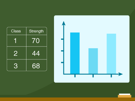
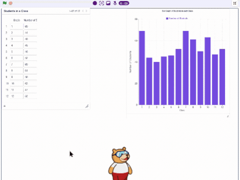
Output
Conclusion
Congratulations! You have successfully built a fully automated bar graph in PictoBlox that:
- Creates a data table for 12 grades with randomized student numbers
- Announces the table to the viewer with a timed message
- Automatically plots and displays a color-coded bar graph on the stage
This project teaches core STEM and AI skills, including data organisation, looping logic, randomisation, and graph-based data visualisation — all using beginner-friendly block coding. You can extend this project further by adding more columns, using real survey data, comparing multiple classes, or even switching to a line graph or pie chart!