

Transform your projects into beautiful, engaging experiences using content creation extension. Add interactive buttons, quizzes, rich text, and smooth navigation to design content that’s not just informative—but exciting to explore. Whether you’re building lessons, stories, or presentations, this tool helps you bring ideas to life and guide users through them in a way that feels fun, intuitive, and impactful. 🚀
Accessing Content Creation Extension in PictoBlox
- In 3D and XR Studio
Following is the process to add Content Creation extension to the PictoBlox Project in the 3D and XR Studio environment
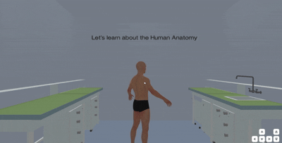
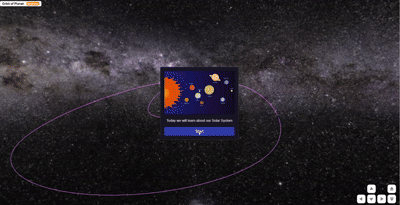
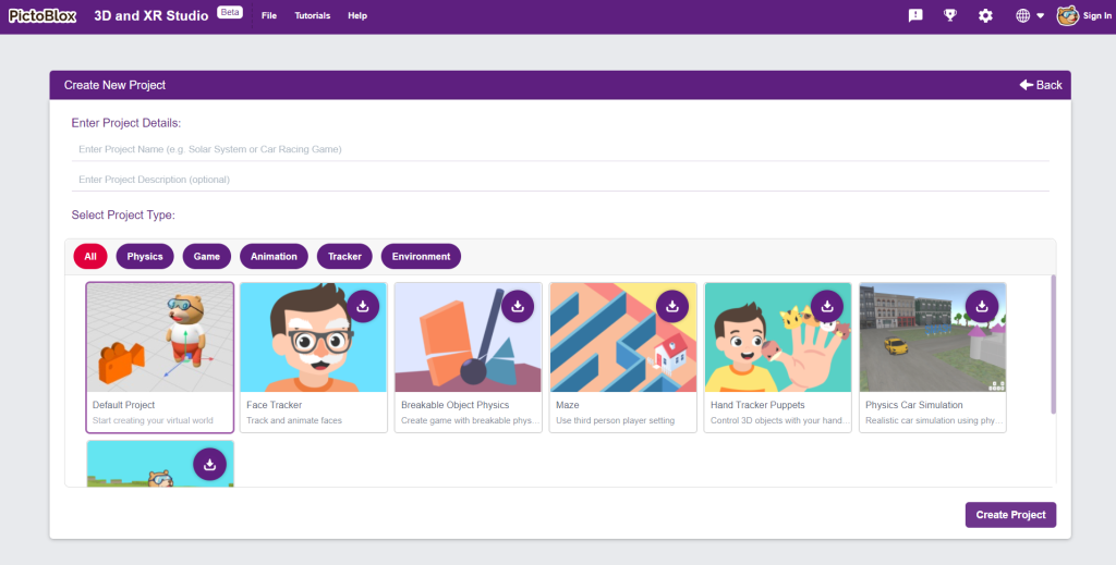
- Open PictoBlox and Select 3D and XR Studio
- Start a new project.
You can choose a default project or select one from the predefined examples.
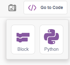
- Locate “Go to Code” in the upper right corner and select block coding.
We are actively developing the extension for Python
- Next, click on the “Add Extension” from Blocks Palette, and add Content Creation Extension
- Content Creation Blocks can be found in the Palette
- Open PictoBlox and Select 3D and XR Studio
- In Block Coding
Following is the process to add Content Creation Extension in a PictoBlox project using Blocks environment.
- Open PictoBlox and Select Blocks Environment
- Next, click on the “Add Extension” from Blocks Palette, and add Content Creation Extension

- Content Creation Blocks can be found in the Palette
- Open PictoBlox and Select Blocks Environment
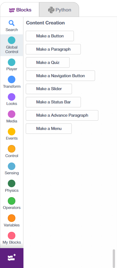
PictoBlox Content Creation Extension Blocks
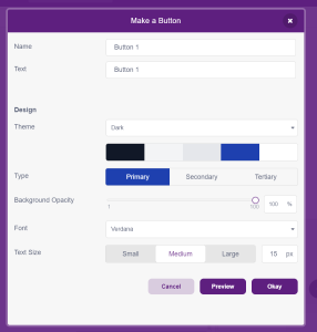
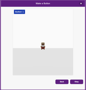
Make a Button Block
Create a Button
This block allows you to create a button and customize it with various options. You can select the text type, theme, opacity, font style, and text size. Additionally, it provides a preview of the button with the selected modifications.
Preview a Button
Button Blocks
| show () button() on the stage block will cause the button to appear on the stage. | 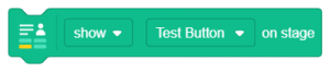 |
| The text on the stage block’s button will be set by using the set () text to () block. | 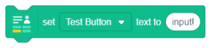 |
| get () text will fetch the button text on the stage | 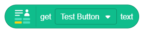 |
| when () is clicked, the function initiates the program. | 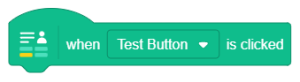 |
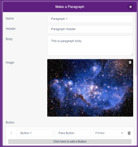
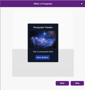
Make a Paragraph Block
Create a Paragraph
Paragraph blocks can be customized with images, buttons, themes, text alignment, font styles, and button layouts. Button alignment and positioning are also adjustable. A preview of the customized paragraph is displayed.
Preview a Paragraph
Paragraph Blocks
| show () paragraph() on the stage block will cause the paragraph to appear on the stage | 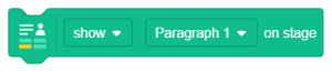 |
| The header of the paragraph on the stage block will be set by using the set () () text to input. | 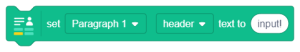 |
| when () () is clicked to start the program. | 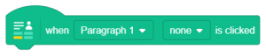 |
Make a Quiz Block
Create a Quiz
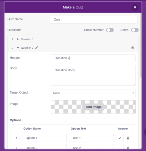
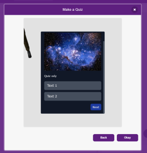
Quiz include displaying the number or score, adding unlimited questions, and incorporating 3D and XR elements by selecting a target object. Users can choose one or multiple correct answers, add images, and customize the design by changing the theme, background opacity, text alignment, font style, text size, and position on the screen. A preview of the quiz with the selected modifications is available, and results are displayed after taking the quiz.
Preview a Quiz
Quiz Blocks
| Display the Quiz on Stage using show () () on stage Block | 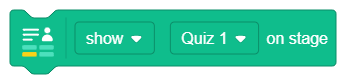 |
| Initiate the Quiz by utilizing the block start () on stage Block | 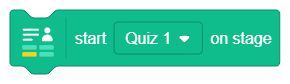 |
| when in () question () is selected, the block can be utilized to perform any operation based on the result of a specific quiz question. | 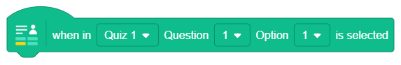 |
| any operation that relies on the quiz can be initiated or completed by using when in () () block | 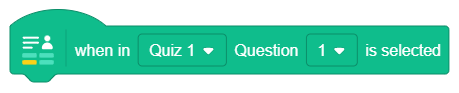 |
| utilize the get () accuracy block to get the accuracy % of the quiz | 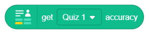 |
| is () question () option () is selected block is used to check which particular option is selected for a particular question for a particular Quiz. | 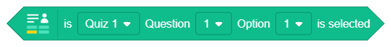 |
| is () question () is selected block is used to check which particular question is selected for a particular Quiz. | 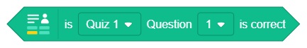 |
| when in () () block is used to start an action based on | 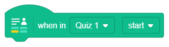 |
Make a Navigation Button
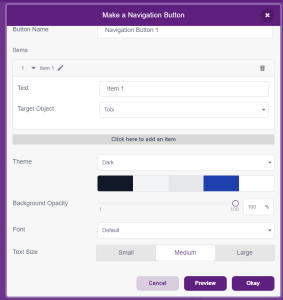
Create a Navigation Button
The navigation button functions as a toggle, allowing users to switch between different options. It can be customized by selecting the target object in 3D and XR studio. Further customization options include theme, background opacity, font style, text size, and target object selection upon navigation. The button can be previewed on the main screen.
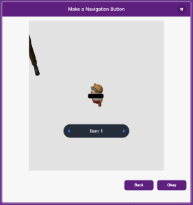
Preview a Navigation Button
Navigation Blocks
| show () () on the stage block will cause the Navigation Button to appear on the stage. | 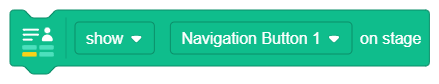 |
| The block when in () item () is selected can be used to perform any action that is based on the navigation button. | 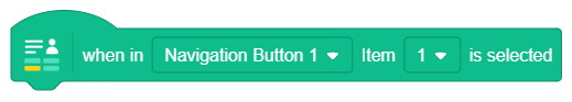 |
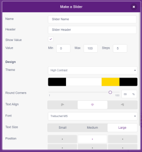
Make a Slider
Create a Slider
The navigation button functions as a toggle, allowing users to switch between different options. It can be customized by selecting the target object in 3D and XR studio. Further customization options include theme, background opacity, font style, text size, and target object selection upon navigation. The button can be previewed on the main screen.
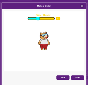
Preview a Slider
Slider Blocks
| show()() on stage will cause the Slider to appear on Stage | 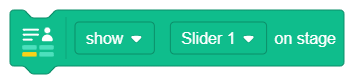 |
| Slide name can be changed using set() text to() block | 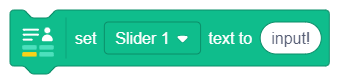 |
| get () value gives you the value of the Slider | 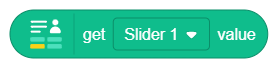 |
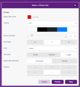
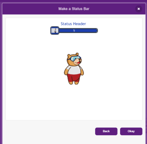
Make a Status Bar
Create a Status Bar
Preview a Status Bar
Slider Blocks
| Using Show() status bar () on stage you can display the Status Bar on the Stage. | 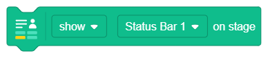 |
| Using set status bar () text to () you can change the text of Status Bar | 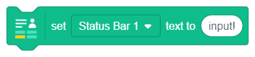 |
| set Status Bar () value to () updates the value of Status Bar | 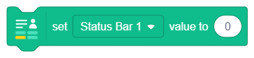 |
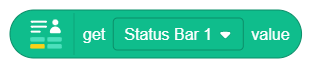
| Using get status bar() value you can fetch the live value of the Status Bar |
 |
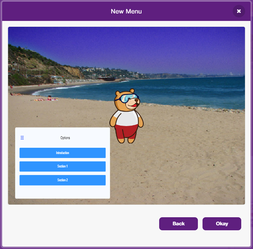
Make a Menu
Create a Menu
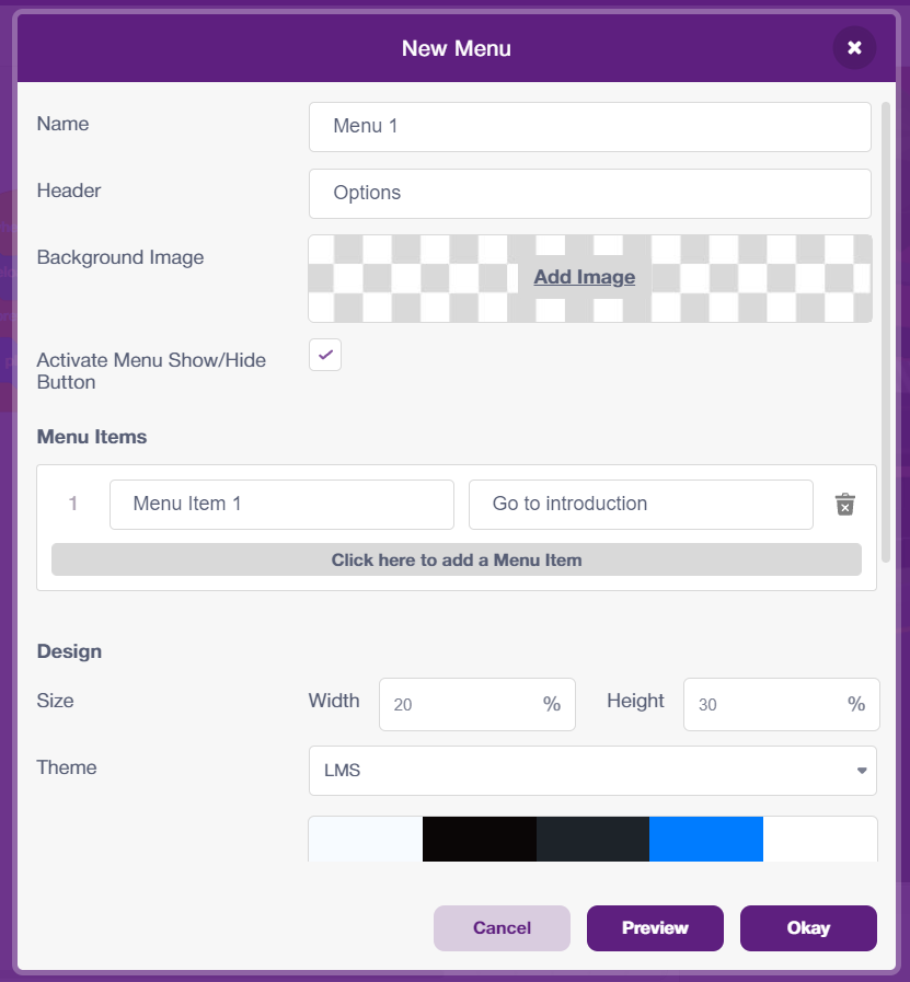
The menu allows creation of a stack of buttons, each with the same width placed one on top of another, where each button can be linked to point to a specific part of the project. The menu has a Menu Show/Hide button in the form on a hamburger menu or three horizontal lines – clicking on it hides and shows the menu on screen. If you want your menu to not have the Show/Hide functionality, you can uncheck the box on the right of Activate Menu Show/Hide Button. Customization options include theme, background image and opacity, font style, and text size.
Preview a Menu
Menu Blocks
| Using Show() menu () on stage you can display the Menu on the Stage. |  |
| The block when in () item () is selected can be used to perform any action that is based on the menu button buttons. | 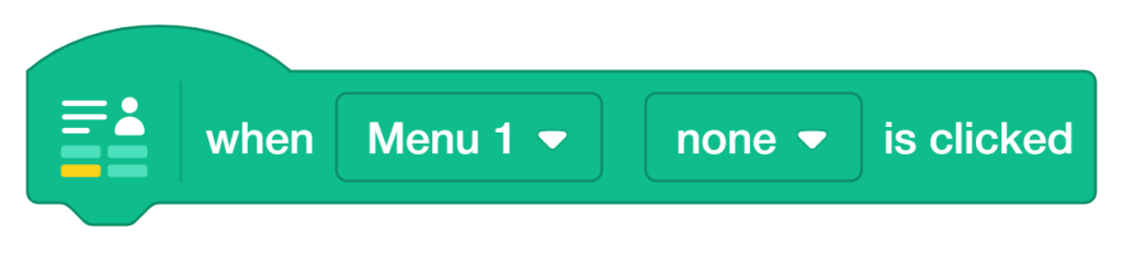 |
Using Content Creation Extension with 3D and XR Studio
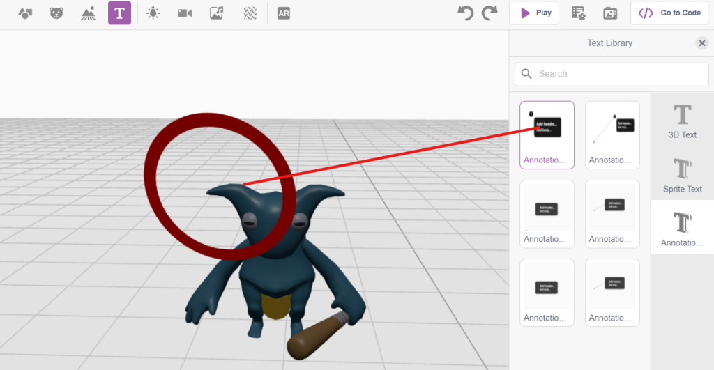
- Click on Add Text Button
- From the Text Library Select Text Annotation
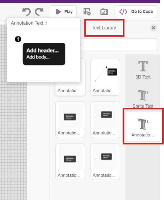
- Drag and drop the Text Annotation 1 onto the Sprite’s right ear to reposition it
- Clicking the marked circle will open the properties panel. This allows you to customize the properties and add as many annotations as desired.
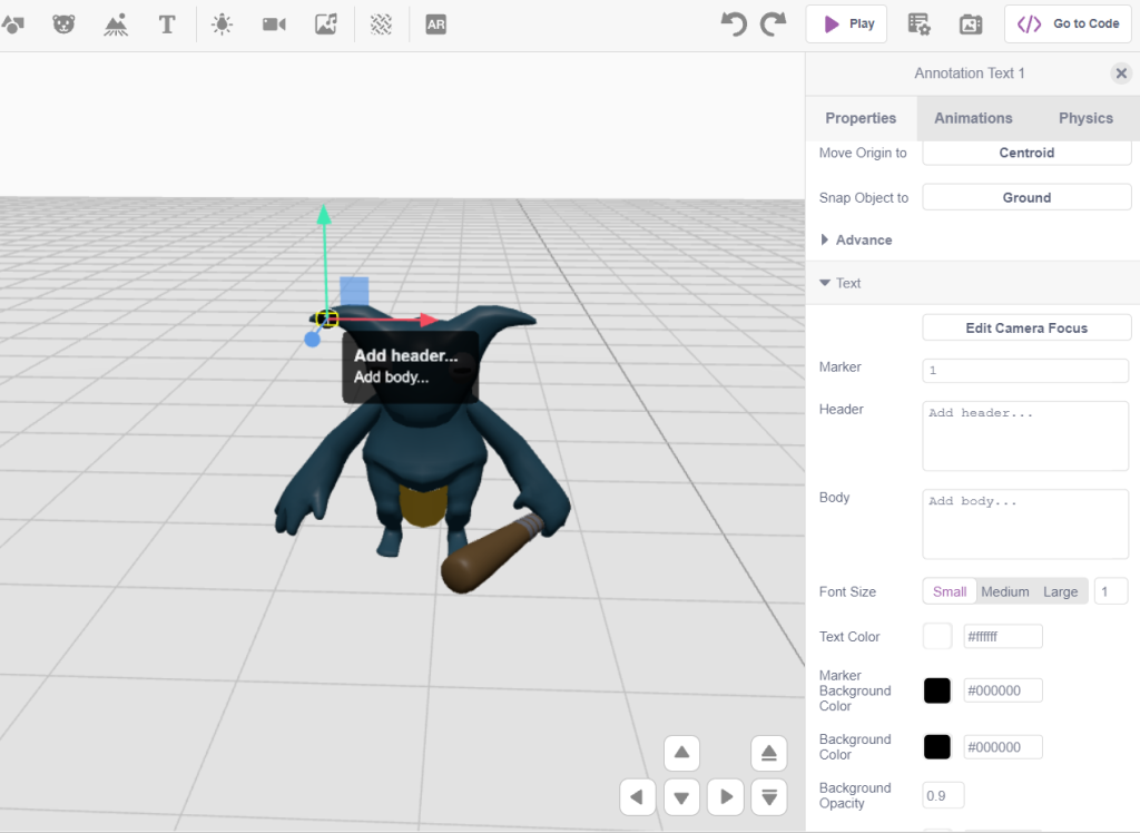
- Switch to block coding to view the output after configuring all the settings.
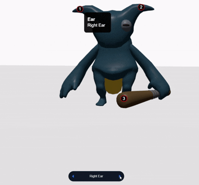
- Add Content Creation Extension to your environment.
- A navigation toggle will automatically appear on your screen once you’ve added this extension. This allows you to easily switch between all the annotations you’ve previously created.
All articles loaded
No more articles to load